Html CSS List UI Design with Cool Hover Effect | Devhubspot
Design
UI
App
CSS
Hover
Html
card
Hey friends, today in this blog, you’ll learn how to create a List UI Design with Cool Hover Effect. If you’re an absolute beginner.
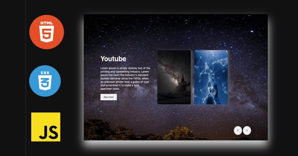
Steps For Creating List UI Design with Cool Hover Effect
To create a To-Do using HTML, CSS, and vanilla JavaScript, follow the given steps line by line:
- Create a folder. You can name this folder whatever you want, and inside this folder, create the mentioned files.
- Create an
index.htmlfile. The file name must be index and its extension .html - Create a
style.cssfile. The file name must be style and its extension .css
To start, add the following HTML codes to your index.html file to create a basic layout for the To-Do.
<!DOCTYPE html><html lang="en"><head><title>Top List Hover Effect</title><meta charset="UTF-8"><link rel="stylesheet" href="./style.css"></head><body><section><div class="box"><h3>Top 5 Creators</h3><div class="list"><div class="imgbox"><img src="./images/1.jpeg" width="100" height="100"></div><div class="content"><h2 class="rank"><small>#</small>1</h2><h4>Ben Ionic</h4><p>Digital Develoepr</p></div></div><div class="list"><div class="imgbox"><img src="./images/2.jpeg" width="100" height="100"></div><div class="content"><h2 class="rank"><small>#</small>2</h2><h4>Nick Youtube</h4><p>Blogger</p></div></div><div class="list"><div class="imgbox"><img src="./images/3.jpeg" width="100" height="100"></div><div class="content"><h2 class="rank"><small>#</small>3</h2><h4>John deo</h4><p>Twitter</p></div></div><div class="list"><div class="imgbox"><img src="./images/4.jpeg" width="100" height="100"></div><div class="content"><h2 class="rank"><small>#</small>4</h2><h4>Megan foxx</h4><p>Feshion</p></div></div><div class="list"><div class="imgbox"><img src="./images/7.jpeg" width="100" height="100"></div><div class="content"><h2 class="rank"><small>#</small>5</h2><h4>White ben</h4><p>Digital artist</p></div></div></div></section><section><div class="box-right"><h3>Top 5 Creators</h3><div class="list"><div class="imgbox"><img src="./images/1.jpeg" width="100" height="100"></div><div class="content"><h2 class="rank"><small>#</small>1</h2><h4>Ben Ionic</h4><p>Digital Develoepr</p></div></div><div class="list"><div class="imgbox"><img src="./images/2.jpeg" width="100" height="100"></div><div class="content"><h2 class="rank"><small>#</small>2</h2><h4>Nick Youtube</h4><p>Blogger</p></div></div><div class="list"><div class="imgbox"><img src="./images/3.jpeg" width="100" height="100"></div><div class="content"><h2 class="rank"><small>#</small>3</h2><h4>John deo</h4><p>Twitter</p></div></div><div class="list"><div class="imgbox"><img src="./images/4.jpeg" width="100" height="100"></div><div class="content"><h2 class="rank"><small>#</small>4</h2><h4>Megan foxx</h4><p>Feshion</p></div></div><div class="list"><div class="imgbox"><img src="./images/7.jpeg" width="100" height="100"></div><div class="content"><h2 class="rank"><small>#</small>5</h2><h4>White ben</h4><p>Digital artist</p></div></div></div></section></body></html>
Next, add the following CSS codes to your style.css file to style the captcha generator and make it interactive and beautiful.
@import url('https://fonts.googleapis.com/css2?family=Poppins:wght@200;300;400;500;600;700;800;900&display=swap');*{margin: 0;padding: 0;box-sizing: border-box;font-family: 'Poppins', sans-serif;}body{display: flex;justify-content: space-around;align-items: center;min-height: 100vh;background: #fcfcfc;}.box{position: relative;min-width: 420px;background: rgb(58, 213, 240);padding: 20px;box-shadow: 0 35px 50px rgba(0, 0, 0, 0.1);}.box::before{content: '';position: absolute;top: 0;right: 0;width: calc(100% - 75px);height: 100%;background: #fff;}.box h3{position: relative;color: #333;font-size: 1.5rem;margin-bottom: 20px;padding-left: 70px;}.box .list{position: relative;display: flex;align-items: center;padding: 10px;margin: 10px 0;cursor: pointer;}.box .list::before{content: '';position: absolute;width: 100%;height: 100%;background: rgb(58, 213, 240);transition: transform 0.5s;transform: scaleX(0);transform-origin: right;}.box .list:hover:before{transition: transform 0.5s;transform: scaleX(1);transform-origin: left;}.box .list .imgbox{position: relative;min-width: 70px;height: 70px;background: #fff;overflow: hidden;border: 5px solid #fff;box-shadow: 5px 5px 15px rgbs(0 , 0, 0, 0.1);margin-right: 20px;margin-left: 10px;}.box .list .imgbox img{position: absolute;top: 0;left: 0;width: 100%;height: 100%;object-fit: cover;}.box .list .content{position: relative;display: flex;flex-direction: column;justify-content: center;width: 100%;color: #333;}.box .list .content .rank{position: absolute;right: 0;font-size: 2rem;color: #fff;transform: scale(0);transition: 0.5s;}.box .list .content .rank small{font-weight: 500;opacity: 0.25;}.box .list:hover .content .rank{transform: scale(1);}.box .list .content h4{font-weight: 600;line-height: 1.2rem;text-transform: uppercase;transition: 0.5s;}.box .list .content p{opacity: 0.85;transition: 0.5s;}.box .list:hover .content h4, .box .list:hover .content p{color: #fff;}.box-right{position: relative;min-width: 420px;background: rgb(58, 213, 240);padding: 20px;box-shadow: 0 35px 50px rgba(0, 0, 0, 0.1);}.box-right::before{content: '';position: absolute;top: 0;left: 0;width: calc(100% - 75px);height: 100%;background: #fff;}.box-right h3{position: relative;color: #333;font-size: 1.5rem;margin-bottom: 20px;padding-left: 70px;}.box-right .list{position: relative;display: flex;align-items: center;padding: 10px;margin: 10px 0;cursor: pointer;}.box-right .list::before{content: '';position: absolute;width: 100%;height: 100%;background: rgb(58, 213, 240);transition: transform 0.5s;transform: scaleX(0);transform-origin: right;}.box-right .list:hover:before{transition: transform 0.5s;transform: scaleX(1);transform-origin: left;}.box-right .list .imgbox{position: relative;min-width: 70px;height: 70px;background: #fff;overflow: hidden;border: 5px solid #fff;box-shadow: 5px 5px 15px rgbs(0 , 0, 0, 0.1);margin-right: 20px;margin-left: 10px;}.box-right .list .imgbox img{position: absolute;top: 0;left: 0;width: 100%;height: 100%;object-fit: cover;}.box-right .list .content{position: relative;display: flex;flex-direction: column;justify-content: center;width: 100%;color: #333;}.box-right .list .content .rank{position: absolute;right: 0;font-size: 2rem;color: #fff;transform: scale(0);transition: 0.5s;}.box-right .list .content .rank small{font-weight: 500;opacity: 0.25;}.box-right .list:hover .content .rank{transform: scale(1);}.box-right .list .content h4{font-weight: 600;line-height: 1.2rem;text-transform: uppercase;transition: 0.5s;}.box-right .list .content p{opacity: 0.85;transition: 0.5s;}.box-right .list:hover .content h4, .box-right .list:hover .content p{color: #fff;}
Conclusion
With HTML and CSS, I aim to show you how to create your own List UI Design with Cool Hover Effect. You may modify your generator to suit your demands because the coding procedure is straightforward and simple to grasp.
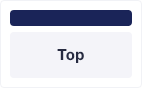
Result

Design
UI
App
CSS
Hover
Html
card