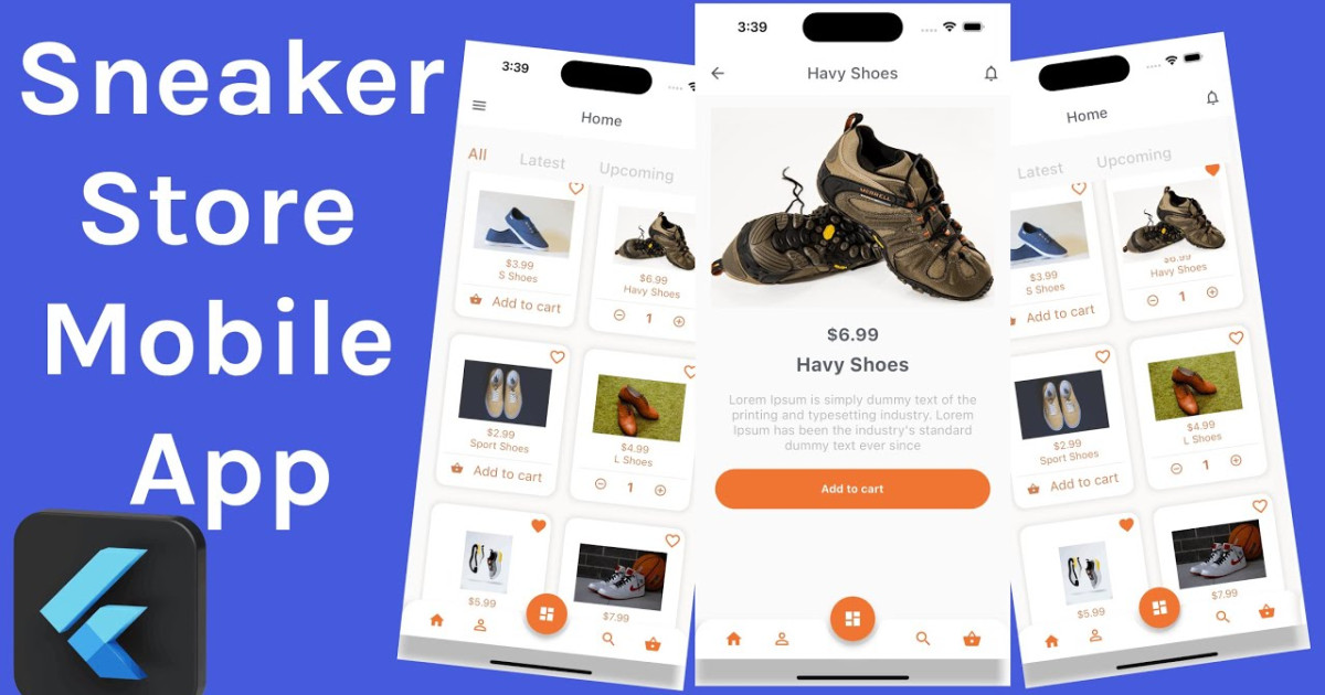
CSS: Isometric Menu Hover Effects @devhubspot Html CSS 3D Menu
effect
CSS
Isometric
Menu
Hover
3D
Html
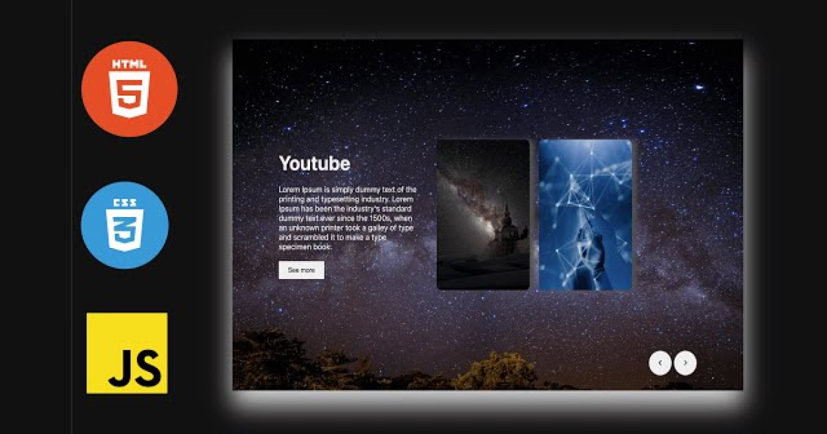
Extraordinary UI design suggests making interactive segments clear and noticeable, and hover effects can help you with doing just that. They look brilliant and give instant feedback when you hover over something that makes your UI easy to investigate. So let us presently have a concise discussion on an example of menu Hover effects using only HTML and CSS.
HTML Code
<!DOCTYPE html>
<html>
    <head>
        <meta charset="utf-8">
        <title>Css Isometric Menu | Devhubspot</title>
        <link rel="stylesheet" href="./style.css" />
    </head>
    <body>
       <div>
            <ul class="ulone">
                <li style="--i:6;"><a href="#">Home</a></li>
                <li style="--i:5;"><a href="#">About-us</a></li>
                <li style="--i:4;"><a href="#">Product</a></li>
                <li style="--i:3;"><a href="#">Service</a></li>
                <li style="--i:2;"><a href="#">Teams</a></li>
                <li style="--i:1;"><a href="#">Contact-us</a></li>
            </ul>

            <ul class="ultwo">
                <li style="--i:6;"><a href="#">Home</a></li>
                <li style="--i:5;"><a href="#">About-us</a></li>
                <li style="--i:4;"><a href="#">Product</a></li>
                <li style="--i:3;"><a href="#">Service</a></li>
                <li style="--i:2;"><a href="#">Teams</a></li>
                <li style="--i:1;"><a href="#">Contact-us</a></li>
            </ul>
       </div>
    </body>
</html>
CSS Code
@import url('https://fonts.googleapis.com/css2?family=Oswald:wght@400;700');

*{
    margin: 0;
    padding: 0;
    box-sizing: border-box;
    font-family: 'Oswald', sans-serif;
}

body{
    display: flex;
    justify-content: center;
    align-items: center;
    min-height: 100vh;
   background: #0e61a073;
}

div{
    display: flex;
    flex-direction: row;
    gap: 200px;
}

.ulone{
    position: relative;
    transform: skewY(-15deg);
}

.ulone li{
    position: relative;
    list-style: none;
    width: 200px;
    background: #550A35;
    padding: 15px;
    z-index: var(--i);
}
.ulone li:hover{
    background: #0090ff;
    transform: translateX(50px);
}


.ulone li::before{
    content: '';
    position: absolute;
    top: 0;
    left: -40px;
    width: 40px;
    height: 100%;
    background: #550A35;
    transform-origin: right;
    transform: skewY(45deg);
    transition: 0.5s;
}

.ulone li:hover::before{
   background: #0090ff;
}


.ulone li::after{
    content: '';
    position: absolute;
    top: -40px;
    left: 0;
    width: 100%;
    height: 40px;
    background: #550A35;
    transform-origin: bottom;
    transform: skewX(45deg);
    transition: 0.5s;
}
.ulone li:hover::after{
    background: #0090ff;
}


.ulone li a{
    text-decoration: none;
    color: #c9c8c8;
    display: block;
    text-transform: uppercase;
    letter-spacing: 0.05em;
    transition: 0.5s;
}

.ulone li:hover a{
    color: #fff;
}


/* new ul */


.ultwo{
    position: relative;
    transform: skewY(-15deg);
}

.ultwo li{
    position: relative;
    list-style: none;
    width: 200px;
    background: #0090ff;
    padding: 15px;
    z-index: var(--i);
}
.ultwo li:hover{
    background: #fff;
    transform: translateX(-50px);
}


.ultwo li::before{
    content: '';
    position: absolute;
    top: 0;
    left: -40px;
    width: 40px;
    height: 100%;
    background: #0090ff;
    transform-origin: right;
    transform: skewY(45deg);
    transition: 0.5s;
}

.ultwo li:hover::before{
   background: #fff;
}


.ultwo li::after{
    content: '';
    position: absolute;
    top: -40px;
    left: 0;
    width: 100%;
    height: 40px;
    background: #0090ff;
    transform-origin: bottom;
    transform: skewX(45deg);
    transition: 0.5s;
}
.ultwo li:hover::after{
    background: #fff;
}


.ultwo li a{
    text-decoration: none;
    color: #c9c8c8;
    display: block;
    text-transform: uppercase;
    letter-spacing: 0.05em;
    transition: 0.5s;
}

.ultwo li:hover a{
    color: #111;
}
Output:

effect
CSS
Isometric
Menu
Hover
3D
Html