Card animation with ReactJS and framer motion - Devhubspot
As a frontend developer, you want your UIs to not only look excellent but to also have that extra spark or "wow" factor. This typically entails incorporating a few animations into the designs, which is typically not too challenging to execute with CSS alone.
Despite the fact that CSS becomes more sophisticated every year, Javascript may be required if you wish to build intricate animations. Fortunately, there is a fantastic package called Framer Motion that can be used to make JS-based animations.
In this article, we'll build a UI with React and Framer Motion that uses several of its features: animation variants, staggering, and much more!
Demo

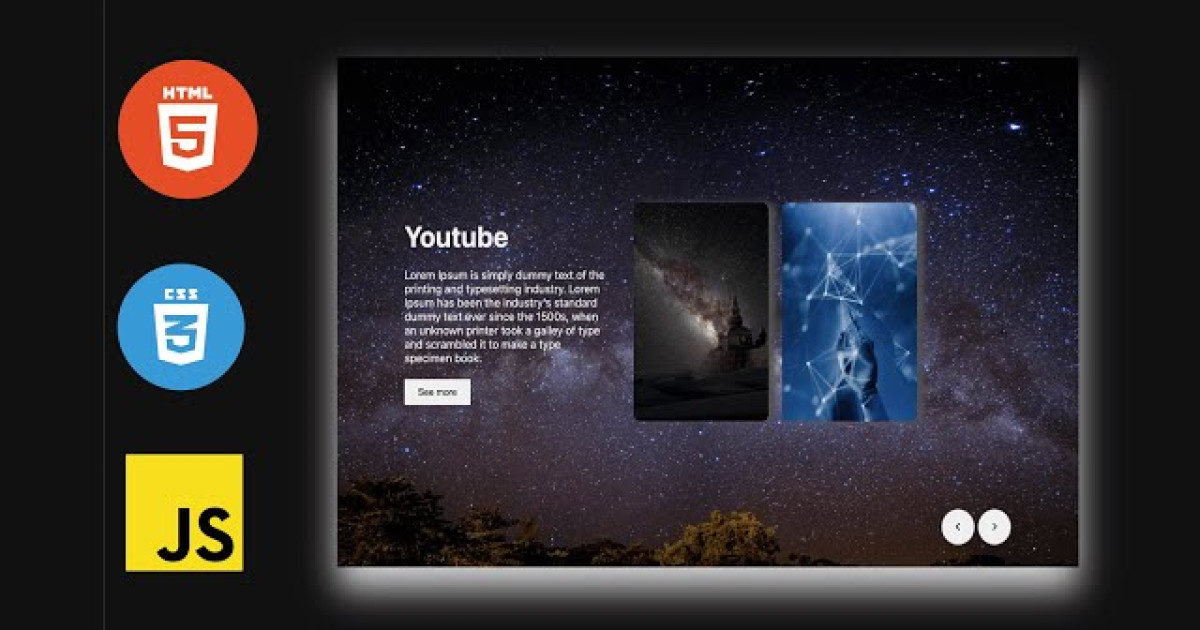
What We're Building
The UI we create will display a user profile card with some basic info. This card can be expanded to show additional details. When the card expands or collapses, we want to animate the card content as it's entering or leaving the document.
We will accomplish this by first adding the components, content, markup and styles, then defining the animations.
UserProfile Card Content:
Let's first define some example content to show in the user profile card.
Add a new file named data.js and within it create an object that will hold all of the content for our UI.
We're setting it up this way so that we don't need to repeat any content inside of the components we'll build.
Data.js
// eslint-disable-next-line import/no-anonymous-default-export
import img1 from './assets/4.jpg'


export default  {
    imgSrc: img1,
    name: "Harry ben",
    designation: "Software develoepr",
    skills:['react', 'angular', 'html'],
    shortDescription:
        "Lorem Ipsum is simply dummy text of the printing and typesetting industry.",
    longDescription:
        "Lorem Ipsum is simply dummy text of the printing and typesetting industry. Lorem Ipsum has been the industry's standard dummy text ever since the 1500s, when an unknown printer took a galley of type and scrambled it to make a type specimen book. It has survived not only five centuries, but also the leap into electronic typesetting, remaining essentially unchanged. It was popularised in the 1960s with the release of Letraset sheets containing Lorem Ipsum passages, and more recently with desktop publishing software like Aldus PageMaker including versions of Lorem Ipsum."
};
Framer Motion Variants
Framer Motion has a concept of "variants," which are objects containing different states an element can be in at any given time. Animations occur between the different variant states that you define.
Variants propagate down to child components to allow for orchestrating animations further down the component tree. Since variants can do so much, we will be using them for all animations in our UI.
The variants we write will be applied to the motion components that were added in the previous sections.
Variants.js
export const cardVariants = {
    inactive:{
        height:"300px",
        width:"500px",
        transition:{
            duration:0.5,
            delay:0.4
        }
    },
    active:{
        height:"90vh",
        width:"100%",
        transition:{
            duration:0.5,
            delay:0.6
        }
    }
}

export const cardContentVariants = {
    inactive:{
        transition:{
            staggerChildren:0.3,
            duration:0.4,
            delay:0.4
        }
    },
    active:{
        transition:{
            staggerChildren:0.3,
            delayChildren:0.3,
            duration:0.4,
            delay:0.4,
            staggerDirection: -1
        }
    }
}

export const thumbnailVariants = {
    inactive:{
        x:-45,
        y:35,
        opacity:0,
        transition:{
            duration:0.4
        }
    },
    active:{
        x:-45,
        y:0,
        opacity:1,
        transition:{
            duration:0.4
        }
    }
}

export const contentVariants = {
    inactive:{
        x:-35,
        y:35,
        opacity:0,
        transition:{
            duration:0.4
        }
    },
    active:{
        x:-35,
        y:0,
        opacity:1,
        transition:{
            duration:0.4
        }
    }
}

export const expandedVariants = {
    inactive:{
        opacity:0
    },
    active:{
        opacity:1,
        transition:{
            staggerChildren:0.3,
            delayChildren:0.3,
        }
    }
}

export const mainImageVariants = {
    inactive:{
        opacity:0,
        x:-65,
        y:-50,
        transition:{
            duration:0.8
        }
    },
    active:{
        opacity:1,
        x:-35,
        y:-5,
        transition:{
           duration:0.8
        }
    },
    exit:{
        opacity:0,
        x:-35,
        transition:{
            duration:0.4
        }
    }
}

export const contentBlockVariants = {
    inactive:{
        opacity:0,
        y:20
    },
    active:{
        opacity:1,
        y:0,
        transition:{
            duration:0.5
        }
    },
    exit:{
        opacity:0,
        y:0,
        transition:{
            duration:0.4
        }
    }
}
Create profileCard.js in components folder componets/profileCard.js and add the following code:
import React, {useState} from 'react';
import { motion , AnimatePresence} from 'framer-motion';
import { cardContentVariants } from '../variants';
import CardContent from './cardContent';
import cardData from '../data';
import ExpandedContent from './expandedContent';

const ProfileCard = () =>{
    const [isExpanded, setIsExpanded] =  useState();
    return (
        <motion.div
            className={`card ${isExpanded ? "expanded" : "initial"} `}
            variants={cardContentVariants}
            animate = {isExpanded? "active":"inactive"}
            initial="inactive"
        >
            <div className='content'>
                <AnimatePresence initial={false} >

                    {
                        !isExpanded ? (
                           <CardContent data={cardData} onClick={setIsExpanded} key={'profile'} />
                        )
                        :
                        <ExpandedContent data={cardData} onClick={setIsExpanded} key={'profile'} />
                    }

                </AnimatePresence>

            </div>

        </motion.div>
    )
};

export default ProfileCard;
After Create cardContent.js in components folder componets/cardContent.js and add the following code:
import React from "react";
import {motion} from 'framer-motion'
import { cardContentVariants, contentVariants, thumbnailVariants } from "../variants";

const CardContent = ({data, onClick}) =>{
    return(
        <motion.div className="flex" variants={cardContentVariants} exit={"inactive"} animate="active" initial="inactive">
            <motion.div className="thumbail-container" variants={thumbnailVariants}>
                <img src={data.imgSrc} alt={data.name} className="thumbnail" />
            </motion.div>
            <motion.div className="initial-content" variants={contentVariants}>
                <h2 className="title">{data.name}</h2>
                <h2 className="designation">{data.designation}</h2>
                <h2 className="main-skills">
                     {data.skills && data.skills.length>0? data.skills.map((item, index)=>(
                        <span key={index} className="skills">{item}</span>
                     )):null}
                </h2>
                <p>{data.shortDescription}</p>
                <button className="info-btn" onClick={()=>onClick(true)}>
                    Detail
                </button>
            </motion.div>

        </motion.div>
    );
};


export default CardContent;
After Create expandedContent.js in components folder componets/expandedContent.js and add the following code:
import React from 'react';
import {motion} from 'framer-motion';
import { contentBlockVariants, expandedVariants, mainImageVariants } from '../variants';


const AnimatedContentBlock = ({children}) =>(
    <motion.div variants={contentBlockVariants}>{children}</motion.div>
);

const ExpandedContent = ({data, onClick}) =>(
    <motion.div variants={expandedVariants} animate="active" initial="inactive" exit="exit">
        <button className='close' onClick={()=>onClick(false)} >
            Close
        </button>
        <motion.div className='flex'>
            <motion.div className='image-container' variants={mainImageVariants}>
                <img src={data.imgSrc} alt={data.name} className='main-image' />
            </motion.div>

            <motion.div className='expanded-dontent'>

                <AnimatedContentBlock>
                    <h2 className='title-large'>{data.name}</h2>
                    <h3 className="designation">{data.designation}</h3>

                    <h5 className="main-skills">
                        {data.skills && data.skills.length>0? data.skills.map((item, index)=>(
                            <span key={index} className="skills">{item}</span>
                        )):null}
                    </h5>
                    <p style={{textAlign:'left'}}>{data.longDescription}</p>

                </AnimatedContentBlock>

            </motion.div>

        </motion.div>
    </motion.div>
)
export default ExpandedContent;
After open App.js and add the following code:
import './App.css';
import ProfileCard from './componets/profileCard';

function App() {
  return (
    <div className="App">
      <ProfileCard />
    </div>
  );
}

export default App;
After add the css code on index.css file
*{
  box-sizing: border-box;
}

:root{
  --white: #fff;
  --black : #222;
  --blue : #317ff9;
  --pink : #ffc7b2;
  --border-raduis: 16px;
}


body{
  font-family: Arial, Helvetica, sans-serif;
  color: var(--black);
  background: #eee;
}

img{
  vertical-align: middle;
  border-radius: var(--border-raduis);
}

button{
  border: none;
  cursor: pointer;
  font-weight: 700;
}

p{
  line-height: 1.4;
  margin: 0 0 10px;
}

h4, h5{
  margin: 0 0 5px;
}

h4{
  font-weight: 400;
}

.app-wrapper{
  margin-top: 50px;
}

.flex{
  display: flex;
  justify-content: space-between;
  align-items: flex-start;
}

.card{
  margin: auto;
  max-height: 700px;
  min-height: 320px;
  max-width: 800px;
  position: relative;
  margin-bottom: 50px;
}

.card::before{
  content: "";
  overflow: hidden;
  background: var(--blue);
  border-radius: var(--border-raduis);
  position: relative;
  width: 100%;
  height: 100%;
  top: 0;
  z-index: 0;
  transform: translate(8px, 8px);
  transition: transform 0.4s ease;
}

.card:hover:not(.expanded)::before{
  transform: translate(15px, 15px);
}


.content{
  background: var(--white);
  border-radius: var(--border-raduis);
  box-shadow:  0 25px 25px rgba(0, 0, 0, 0.1);
  padding: 22px 14px;
  z-index: 2;
  position: relative;
  display: flex;
  height: 100%;
}

.info-btn{
  background: var(--blue);
  color: var(--white);
  padding: 10px 20px;
  font-size: 16px;
  border-radius: 8px;
  width: 100%;
}

.thumbnail-container{
  margin-right: 3%;
  align-self: center;
}
.thumbnail{
  max-width: 180px;
  height: auto;
}

.title{
  margin:  0 0 10px;
  text-align: left;
}

.designation{
  font-size: 16px;
  margin: 0 0 10px;
  text-align: left;
}

.initial-content span{
  display: block;
  width: 100%;
  margin-bottom: 10px;
}
.main-skills{
  width: 100%;
  display: flex;
  flex-direction: row;
  gap: 10px;
}
.skills{
  font-size: 14px;
  background: var(--pink);
  color: var(--black);
  padding: 6px 15px;
  border-radius: 8px;
  margin-bottom: 10px;
}

.close{
  background: none;
  padding: 5px;
  position: absolute;
  z-index: 3;
  right: 10px;
  top: 10px;
}

.card svg{
  height: 40px;
  width: 40px;
}

.expanded-content{
  overflow: auto;
  max-height: 82vh;
  width: 55%;
}

.main-image{
  /* max-width: 360px; */
  width: 100%;
}


.title-large{
  font-size: 40px;
  margin: 10px 0;
}

.card-bottom{
  margin-top: 16px;
}
Summary
Creating animations with Framer Motion is an overall different approach than using regular CSS, but as we've seen in this article, they are not too difficult to achieve.
Ultimately, the right tool for the job always depends on the project, and Framer Motion is certainly a good tool to add to your inventory.